

Who owns the information, he owns the world.
This phrase was said by Nathan Rothschild back in 1815, but it does not lose its relevance today.
However, in 2020 it is not enough just to have information. It is necessary to be able to analyze it and make the right strategic decisions. While strategy is the prerogative of managers and business owners, analysis can be handled by Power BI.
Microsoft Power BI is a platform for business intelligence, data visualisation, and report generation. If your business is already working with Power BI, you will be interested to learn about the updates to the desktop version that became available in November 2020.
Reports
New header for table cards
Table card headers are now color coded to help you quickly identify which tables were taken from the same source. All tables in import mode will have no color.
Card tooltips
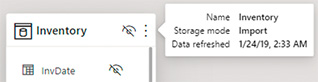
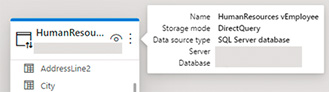
When you hover over the table card headers, you will see a tooltip giving you more details about that table in your model.
For a table that has been imported, you can see the name of the table, the storage mode it is in, and when the data in that table was last refreshed.
For a table in DirectQuery mode, you can see the name of the table, the storage mode, the type of data source being used, and the server and database names.
Collapse Card
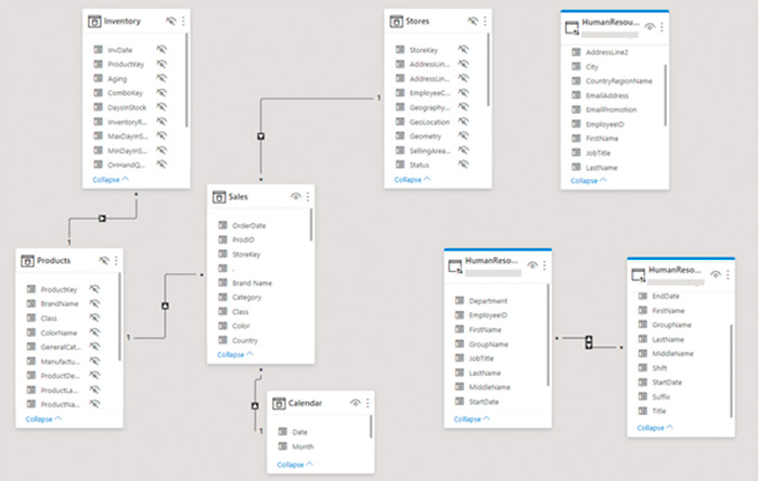
To simplify the look of your model, you can collapse table cards to make them smaller.

You can also collapse your table cards but continue to show key fields.

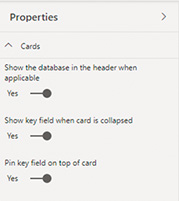
Table Card Properties
You can change how table cards in the model view display information with card properties. To see card properties, make sure you do not have a table or field selected.
Performance Improvements
Microsoft has made some performance improvements to the model view. If you have a large model (more than 50 tables), instead of trying to show all your tables and hitting performance errors, Power BI will load and let you decide the layouts that you would like to work with.

Visual Zoom Slider
You can now add zoom sliders to your charts. This will enable thorough examination of a smaller range of the data in a chart without having to use a filter. Zooming is possible by both X and Y axes. Further, using zoom sliders will not affect contextual information like calculated trendlines.
Zooming will be saved when publishing your reports. When end users open the report, the endpoints of the zoom slider will default to whatever you have saved, allowing you to highlight a specific window of data while keeping its context immediately accessible.
Data Point Rectangle Zooming
Just as you could zoom along the X and Y axes, you can select a rectangular area with points and zoom into this rectangle.
Apply All Filters
Since November, the Apply All Filters feature has been available in the main functionality. This option is useful if you do not want to wait for each filter change. Now you can click Apply once after you configure all changes in reports or visual elements.
Analytics
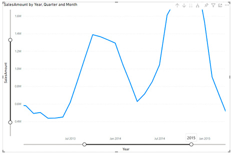
Automatic Anomaly Detection
Anomaly detection helps you enhance your line charts by automatically detecting anomalies in your context. It also helps analyze their root causes.

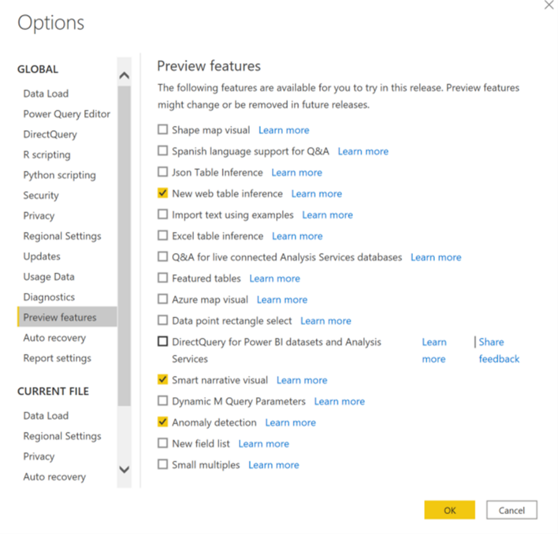
Since this feature is not in the main functionality yet, you will first need to turn on the feature switch by going to File > Options and Settings > Options > Preview feature and make sure “Anomaly detection” is turned on.
Data Sources
New Connectors
Power BI introduces the ability to connect to other data sources. You can find connectors such as Hive LLAP, Actian, Anaplan, Starburst Presto in the Other category of the Get Data dialog box.

Dear users, please note that all the updates outlined in this article are relevant to Power BI Desktop.
We hope the new features will make your work with data even more enjoyable and productive. For more information on updates, please visit the official Microsoft blog in English.
We wish you weighted analytics!